When faced with large quantities of data which you need to make sense of, it might be difficult to know where to begin looking for interesting trends. Rather than trying to make specific predictions with the data, you might want to start with simply exploring the data to see what's there. For this task, we turn to unsupervised machine learning. In contrast to supervised learning, unsupervised models take only the input data and search for interesting patterns on their own, without human intervention.
One of the most common unsupervised approaches in exploratory data mining is called clustering, which attempts to group together observations into subgroups based on their similarity. Examples of this include: grouping customers based on similar characteristics, grouping texts based on similar content, grouping "friends" on Facebook, clustering cancerous tumors, and many others. We simply feed the model data, and the model separates the data into similar groups.
This article walks readers through the tasks of K-means and hierarchical clustering using a timely example: politics. While Barack Obama's 2012 campaign skillfully deployed data science techniques, many analysts are also criticized for incorrectly predicting the outcome of the 2016 election. This article provides a look at one such model which might be useful for analyzing politics and provides a chance for you to try implementing an unsupervised machine learning model yourself.
Getting started
Let's begin by loading our data and some packages which are helpful for the task of clustering. This article uses the statistical language R implemented in R Studio. Be sure to install R if you don't already have it.
Let's load three packages. The cluster package hosts a variety of clustering functions, as well as the data we'll use. The dendextend and circlize packages will be used for visualizing our clusters. If you haven't used these packages before, first use the install.packages("") command to obtain the packages. Then, you can load them from your library as shown below.
library(cluster)
library(dendextend)
library(circlize)
With our packages loaded, let's import our data directly from the cluster package. The dataset we'll use is called votes.repub and it contains the percentage of votes given to the Republican candidate in presidential elections from 1856 to 1976 by state. This data can be imported directly from the cluster package using the cluster:: command. We'll name it raw.data.
raw.data <- cluster::votes.repub
You can use the View() function to take a look at the raw data. You'll see states listed on the left, election years as the column names, and the percentage of the state's vote which went to the Republican candidate in each cell.
Let's conduct our analysis on the most recent year in the dataset: 1976. This means we need to pull out only the 1976 data by subsetting our data. We define the variable we want to keep -- "X1976" -- and pull this out from the raw data using square brackets.
keep <- c("X1976")
votes.1976 <- raw.data[keep]
Now that we have our packages loaded and data subsetted, we're ready to begin modeling.
Clustering in R
Clustering is one approach to unsupervised machine learning -- cases where you have only the observations and you want a model to search for interesting patterns without you specifying exactly what you're looking for. Clustering is a broad set of techniques which can assist you in this task.
Clustering partitions your data into distinct groups such that the observations within each group are relatively similar. For example, you might have data from Twitter and want to group tweets based on the similarity of their content. A clustering algorithm will then sort the tweets into groups. You might notice patterns, such as tweets grouped together which talk about politics versus celebrity gossip. Or, perhaps you have a subset of tweets which all mention a newly released movie. You could then perform clustering on those tweets to see if subgroups emerge perhaps based on positive or negative language used in the tweets. This helps to reveal interesting patterns in your data and might lead you to further analyze the resultant patterns.
We're going to try two different clustering methods: K-means and hierarchical. With K-means, you specify the number of clusters (K) into which you'd like your data to be sorted. The algorithm searches for the best sorting of your data such that within-cluster variation is as small as possible, i.e. the most homogeneous groupings as possible.
But, sometimes you don't know the number of subgroups you're looking for. So, we'll also use hierarchical clustering. The hierarchical clustering algorithm takes the distances or dissimilarities between observations, and groups observations based on those that are the most or least similar. It does this in a tree-like fashion and produces a very interpretable plot called a dendrogram.
We could apply these models to any sort of data we would like grouped, but we're going to apply both of these approaches to our voting data to illustrate the differences. Our goal is to find groups of states which vote similarly or differently in the presidential election. This might be helpful information for political consultants and analysts, but this sort of information is also used for things like market research in industry or political science research in academia.
Let's begin with K-means clustering. To implement this in R, we use the kmeans function. In brackets, we'll tell the function to perform K-means on our 1976 voting data. Because we have to specify the number of groups we want, we'll use K=2, since we know that each state's majority vote must have gone to either the Democrat candidate Jimmy Carter or the Republican candidate Gerald Ford.
set.seed(1912)
votes.km <- kmeans(votes.1976, 2, nstart=50)
We can then visualize the results from the model. A circular dendrogram provides a helpful visualization. We can also color the states as red or blue to align with the political party affiliation of the candidate for which they voted.
dist.km <- dist(votes.km$cluster)

colors <- c("blue3", "red3")
clust.km <- hclust(dist.km)
circle.km <- color_labels(clust.km, k=2, col = colors)
par(cex =.75)
circlize_dendrogram(circle.km)
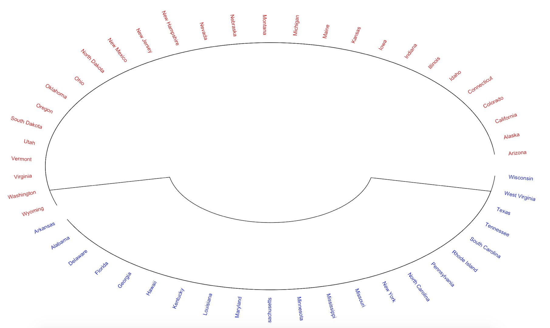
This provides a nice, tidied-up representation of the states voting patterns.
But maybe you'd like a more nuanced picture of what's going on. For example, you might have two states which voted 30% and 49% Republican and two other states which voted 51% and 65% Republican. In K-means clustering (and in presidential elections) the observations under 50% will be classified as voting Democrat and over 50% as Republican. But actually, the states which voted 49% and 51% are much more similar than the states which voted 30% and 65%.
For this, we turn to hierarchical clustering. First we need to measure the distances (or dissimilarities) between the states' votes. The logic is that we want to cluster together states whose populations vote more similarly than others.
We'll use a common measure -- Euclidean distance -- but many measures are available in statistics and mathematics and largely depend on the sort of data you're using and the task you're trying to accomplish. For more on the issue of selecting a distance/dissimilarity measure, check out this StackExchange post.
We can measure distances using the dist() function and set the distance method as "euclidean."
data.dist <- dist(votes.1976, method = "euclidean")
We then perform hierarchical clustering on our set of distances using the hclust function and plot the result.
clust.h <- hclust(data.dist)
par(cex =.8)
plot(clust.h, xlab = "States", sub="")
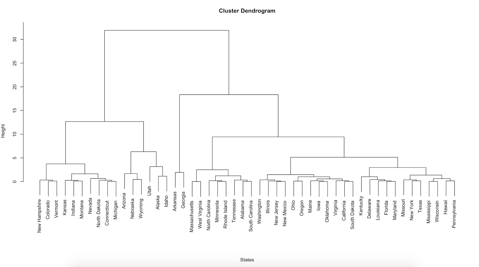
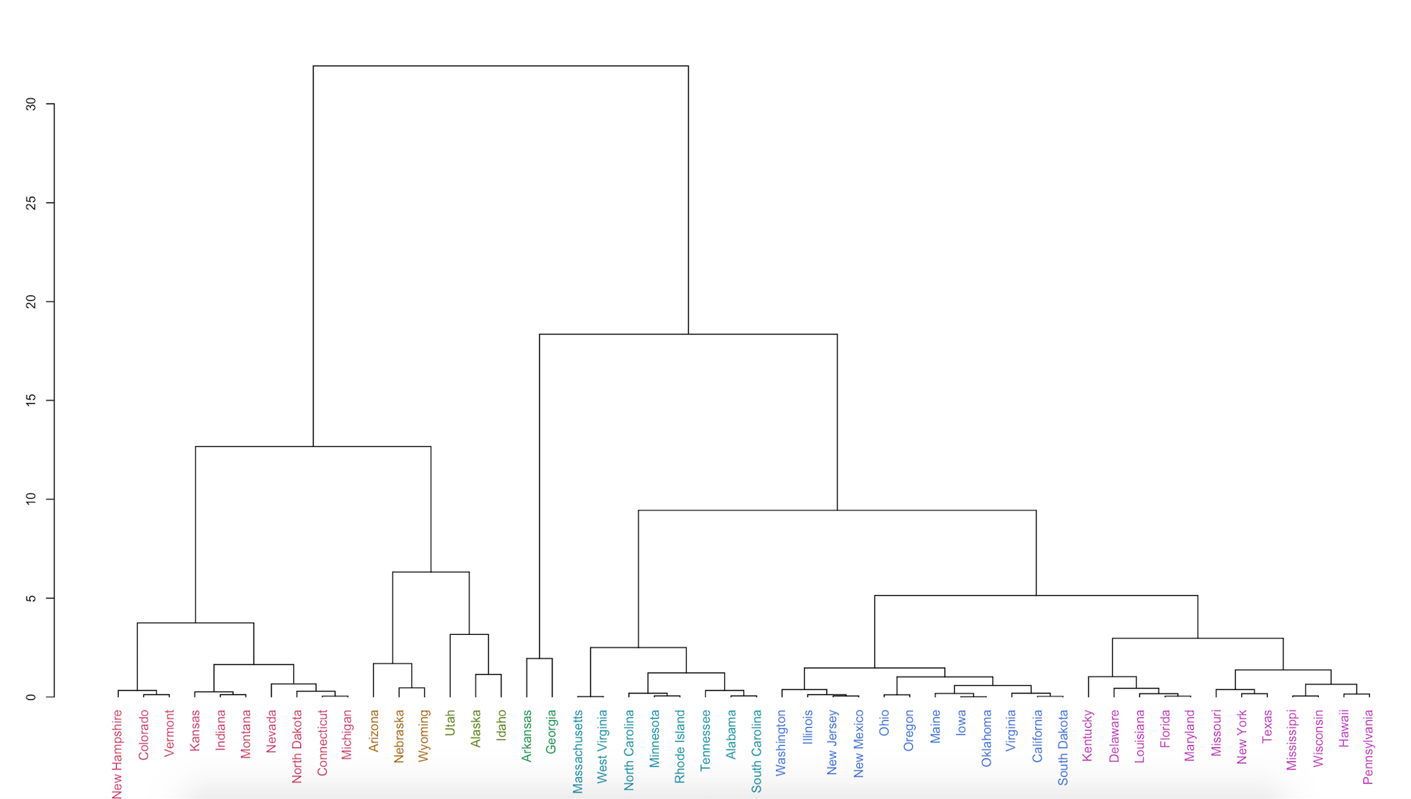
Notice that there is a lot more variation in our data. Each leaf (or state) is positioned together by similarity and attached by branches. The height of the branches on the left-hand axis gives you an idea of how similar or different each state is. We can "cut" the tree at different heights of interest. It looks like there are about seven groupings which the hierarchical algorithm finds (compared to the two sets from K-means) at a height cut of 6. To make this more clear, we can color the leaves using the color_labels function from the dendextend package and specify that we'd like to see these seven groups colored.
clust.h.color <- color_labels(clust.h, k=7)
par(cex =.7)
plot(clust.h.color)
This shows a more accurate picture of how similarly state populations vote. This implies that the electoral map might not tell the complete story: even though some states technically voted Democrat or Republican, their populations of voters can be quite heterogeneous in their preferences.
Concluding notes
In this tutorial, we discussed the unsupervised machine learning method of clustering and illustrated both K-means and hierarchical clustering using data on states' votes during the 1976 presidential election. We were able to sort states according to their vote for the Democrat or Republican candidate, but also according to how similar state voting habits were.
If you're interested in a more technical treatment of this topic, check out Chapter 10 of An Introduction to Statistical Learning. Or, try playing around with some of the other datasets available directly in R. You can try clustering anything from Iris flowers to microarray gene expressions used to classify and diagnose cancer.
These methods are especially useful, however, when you have access to massive quantities of data. Try finding data which interests you, whether it's a source like Facebook or Twitter or the attributes of customers who purchase your product. Through clustering techniques you might discover new ways of grouping and understanding your data.