Aleatoric uncertainty is a key part of machine learning models. It comes from the inherent randomness or noise in the data. We can't reduce it by getting more data or tweaking the model design. Visualizing aleatoric uncertainty helps us understand how the model performs and where it's unsure. In this post, we'll explore how TensorFlow Probability (TFP) can visualize aleatoric uncertainty in ML models. We will give an overview of aleatoric uncertainty concepts. We'll include clear code examples and visuals showing how TFP captures and represents aleatoric uncertainty. Finally, we'll discuss the real benefits of visualizing aleatoric uncertainty in ML models. we'll also highlight cases where it can help decision-making and improve performance.
Visualizing Aleatoric Uncertainty using TensorFlow Probability
TensorFlow Probability (TFP) lets you perform probabilistic modeling and inference using TensorFlow. It's got tools for building models with probability distributions and probabilistic layers. With TFP, you can see the uncertainties in your machine learning models, which is super helpful.
Let's look at an example - the MNIST dataset with handwritten digits. We'll use a convolutional neural net (CNN) to classify the images, and then, we can model the CNNs output as a categorical distribution with TFP. Here's some code to show how it works:
import tensorflow as tf
import tensorflow_probability as tfp
import matplotlib.pyplot as plt

# Define the model
model = tf.keras.Sequential([
    tf.keras.layers.Conv2D(32, (3, 3), activation='relu', input_shape=(28, 28, 1)),
    tf.keras.layers.MaxPooling2D((2, 2)),
    tf.keras.layers.Flatten(),
    tf.keras.layers.Dense(10),
])

# Load the MNIST test set
test_images, test_labels = tf.keras.datasets.mnist.load_data()[1]

# Preprocess the test set
test_images = test_images.astype('float32') / 255.
test_images = test_images[..., tf.newaxis]

# Make predictions on the test set
predictions = model.predict(test_images)

# Convert the predictions to a floating-point type
predictions = predictions.astype('float32')

# Convert the predictions to a TensorFlow Probability distribution
probs = tfp.distributions.Categorical(logits=predictions).probs_parameter().numpy()

# Get the predicted class labels
labels = tf.argmax(probs, axis=-1).numpy()

# Get the aleatoric uncertainty
uncertainty = tf.reduce_max(probs, axis=-1).numpy()

# Visualize the aleatoric uncertainty
plt.scatter(test_labels, uncertainty)
plt.xlabel('True Label')
plt.ylabel('Aleatoric Uncertainty')
plt.show()- Import the necessary libraries: We had to bring in the right libraries - TensorFlow and TensorFlow Probability for working with probability and inference, and Matplotlib to display the data visually.
- Define the model: A Sequential model is defined using Keras, which is a plain stack of layers where each layer has exactly one input tensor and one output tensor. The model consists of a convolutional layer with 32 filters of size (3,3), a max pooling layer, a flatten layer, and a dense layer with 10 units.
- Load the MNIST test set: We used Keras to load up the MNIST test images of handwritten numbersI used Keras to load up the MNIST test images of handwritten numbers
- Preprocess the test set: We preprocessed by normalizing the pixel values between 0 and 1 and adding a new axis to make them compatible with the model.
- Make predictions on the test set: We ran the test images through the model to get predictions.
- Convert the predictions to a floating-point type: The predictions are converted to a floating-point type to make them compatible with the TFP distribution.
- Convert the predictions to a TensorFlow Probability distribution: Using TFP's Categorical, we turned the predictions into probability distributions over the classes.
- Get the predicted class labels: We get the predicted class labels by taking the class with the highest predicted probability for each data point.
- Get the aleatoric uncertainty: To measure the inherent randomness in the model's predictions, we look at the maximum predicted probability for each data point. This is called the aleatoric uncertainty.
- Visualize the aleatoric uncertainty using a scatter plot: To visualize the uncertainty, we can make a scatter plot with the true labels on x-axis and the aleatoric uncertainty values on the y-axis. This lets you see how the uncertainty varies across different data points and different true classes. Points with low maximum probabilities will have high aleatoric uncertainty and appear higher on the plot.
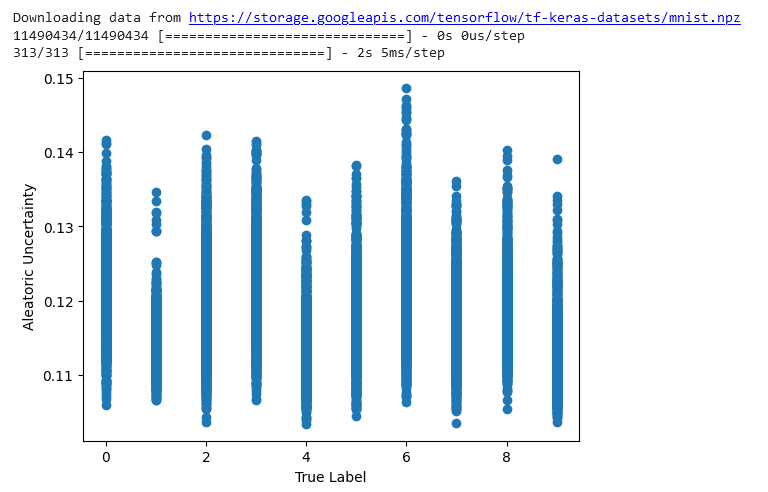
The plot from the code shows how the true label relates to the aleatoric uncertainty. The x-axis represents the real digit in the image - the true label. And the y-axis represents the maximum probability from the predicted distribution - that's the aleatoric uncertainty.
The aleatoric uncertainty captures the randomness or noise in the data using a probability distribution for the model's predictions. High uncertainty means the model's not very confident in its prediction. Low uncertainty means that the model is pretty sure of the prediction.
Looking at the plot can help to understand how well the model is working and where it struggles. For example, high uncertainty for some true labels could indicate that the model is struggling to make accurate predictions for that range of labels.
Conclusion
TensorFlow Probability (TFP) is a pretty handy library that lets you visualize the inherent randomness (also called aleatoric uncertainty) in machine learning models. With TFP, you can build models that actually output probability distributions. This is useful because it gives you a sense of how unsure the model is about its predictions. If you visualize these probability distributions in a scatter plot, you can literally see the uncertainties. Wider distributions mean more uncertainty - the model isn't very confident. Tighter distributions mean lower uncertainty - the model is pretty sure of the prediction.
Visualizing aleatoric uncertainty can help us understand how well the model is working and where it struggles. For instance, you might see high uncertainty for some true labels telling you the model is having trouble in that area of the input space. Or maybe the uncertainty is low across the board except for a few stray data points - could those be mislabeled in the training data? The point is, visualizing aleatoric uncertainty opens up possibilities for debugging and improving your models.