
Machine Learning models have for long been infamous for frequently being Black Box or "unexplainable". Even the people working with these models are not privy to the model's internal weights and decisions. Moreover, if you have stakeholders you are answerable to, having a black- box model is no longer a choice.
Here's a classic meme on the state of Interpretability right now.
Are the people in the industry, the only ones to blame? Not really, almost all of the research in the field of AI is concentrated towards better architectures, beating benchmarks, novel techniques for learning, or in some cases just building up huge models with a billion parameters. Research in interpretable Machine Learning is relatively untouched. The growing popularity (caused by "click-baity" media headlines) and complexity of AI in media only serves to worsen the situation for interpretability.
Here are some other reasons why interpretable ML is so important.
- Human curiosity and Learning - The human species is curious by nature. Humans specially look for explanations when something contradicts their prior beliefs. A person on the internet might get curious as to why certain products and movies are being recommended. To address this innate desire, companies have started to explain their recommendations.
- Building Trust - When you are selling your ML product to a prospective buyer, why should they trust your model? How can they know the model will produce good results under all circumstances? Interpretability is required to increase social acceptance of ML Models in our day-to-day lives. Similarly, a consumer interacting with their personal home assistant would want to know the reason behind a certain action. Explanations help us understand and empathize with the machines.
- Debugging and detecting bias - When you are trying to reason an unexpected result or finding a bug in your model, Interpretability becomes very useful. Recently, ML models have also been in the light for being biased towards some ethnicity and gender, with interpretable models this can be detected and corrected, before the model gets deployed in the real world.
Interpretability and performance do not go hand in hand
There are some high-risks domains such as finance and healthcare where Data Scientists often end up using more traditional machine learning models (linear or tree-based). This is because, the ability of the model to explain its decisions is really important to the business. If for example, your model rejects the loan application of a person, you cannot get away by not knowing what factors contributed to that decision made by the model. Although, simple ML models do not perform as well as their more complicated counterparts like neural networks, they are intrinsically interpretable and more transparent. Decision trees can be easily visualized to understand which features were used at which levels to make decisions. They also come with a feature importance attribute, that informs which features contributed the most in the model.
However, using such simplistic models always at the risk of performance isn't really a solution. We need complex models like ensembles and neural network which can more accurately capture the non-linear relationships in the data. This is where model-agnostic interpretation methods come in.
In this blog, we'll explore some of these interpretation techniques using a Diabetes Dataset and train a simple classification algorithm on it. Our objective will be to predict whether a person is diabetic based on their features and we'll try to reason the prediction of the model.
So, let's get started!
import pandas as pd
from sklearn.ensemble import RandomForestClassifier
from sklearn.model_selection import train_test_split
Loading the dataset to look at the features.
df = pd.read_csv("diabetes.csv")
df.head()
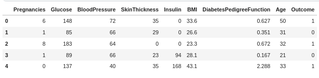
I'll briefly explain the features:
- Pregnancies- Number of past pregnancies of the patient
- Glucose - Plasma glucose concentration(mg/dL)
- Blood Pressure - Diastolic blood pressure (mm Hg)
- Skin Thickness - Triceps skin fold thickness (mm)
- Insulin - 2-Hour serum insulin (mu U/ml)
- BMI- Body mass index (weight in kg/(height in m)^2)
- Diabetes Pedigree Function- It determines whether a trait has a dominant or recessive pattern of inheritance. It is calculated when a patient has a diabetes history in the family.
- Age- Age in years.
- Outcome- Whether a person has diabetes or not( 0=No, 1=Yes)
Let's split our dataset into training and testing and fit a model.
target=df['Outcome']
df=df.drop(labels=['Outcome'],axis=1)
# train-test split
X_train, X_test, y_train, y_test = train_test_split(df, target, test_size=0.2, random_state=42)
# fit the model
rfc=RandomForestClassifier(random_state=1234)
rfc.fit(X_train,y_train)
# evaluate the results
rfc.score(X_test,y_test)
Now, that we have a basic model, it's time to explore the interpretation techniques. The first one is feature importance which is a technique specific to Decision trees and their variants.
Feature importance
Feature importance or permutation feature importance for a feature is measured by permuting the feature and observing the model's error. The intuition is that if shuffling a feature changes the model's error, which implies the model relied on the feature for prediction, then the feature is important. The inverse is also true.
import seaborn as sns
features =["Pregnancies","Glucose","BP","SkinThickness","Insulin","BMI","DPFunc","Age"]
all_feat_imp_df = pd.DataFrame(data=[tree.feature_importances_ for tree in
                                     rfc],
                               columns=features)
(sns.boxplot(data=all_feat_imp_df)
        .set(title='Feature Importance Distributions',
             ylabel='Importance'));
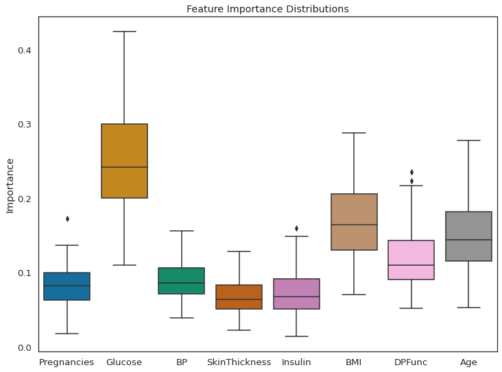
As per feature importance, the Glucose level in the blood, along with BMI and age, are the most important features in classifying a patient as diabetic. The result seems justified. High glucose level in blood is basically diabetes, and obese people are more prone to it. This research has shown that, older adults are at high risk for the development of type 2 diabetes due to the combined effects of increasing insulin resistance and impaired pancreatic islet function with aging.
Until now, we can say our model is doing a good job in classifying the data. It has learned the right weights and can be trusted.
Takeaways:
- Feature Importance provides a highly compressed, global insight into the model’s behavior.
- Permutation feature importance is derived from the error of the model. In some cases, you might want to know how much the model’s output varies for a feature without considering what it means for performance.
- Having correlated features can decrease the importance of the associated feature by splitting the importance between both features.
Bring this project to life
Sample ML: Decision Trees
A big advantage of using Decision Trees is they can be pretty intuitive. Next, we'll plot the tree itself, to understand the decisions made at each node in the tree.
from IPython.display import Image
from sklearn.tree import export_graphviz
import graphviz
import pydotplus
from io import StringIO

# Get all trees of depth 3 in the random forest
depths3 = [tree for tree in rfc.estimators_ if tree.tree_.max_depth==3]
# grab the first one
tree = depths3[0]
# plot the tree
dot_data = StringIO()
export_graphviz(tree, out_file=dot_data, feature_names=features,
                filled=True, rounded=True, special_characters=True)
graph = pydotplus.graph_from_dot_data(dot_data.getvalue())
Image(graph.create_png())
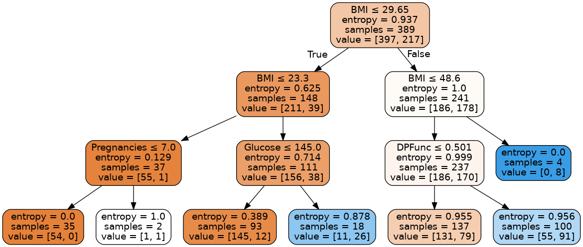
Every non-leaf node is split based on the feature that is written at the top of the node. Towards the left part of the tree we classify samples as non-diabetic and towards the right part as diabetic. The entropy function at the leftmost leaf node becomes 0 because the data becomes homogeneous (all the samples are either diabetic or non-diabetic). The first value in the value array tells how many samples are classified as non-diabetic and second value tells how many samples are diabetic. For the leftmost leaf node, entropy is 0 because all the 54 samples are non-diabetic.
Trees are probably the most intrinsically interpretable models out there. There are other such models too, like Generalized Linear Models, Naive Bayes, K-Nearest Neighbors, but the problem with using these methods is that they are different for different models. Interpretation thus varies. What you would use to interpret a Logistic Regression model won't be the same as the interpretation method for a KNN. Therefore, the rest of the blog is dedicated towards methods that are independent of the model on which they are being applied.
Model agnostic methods
We'll start model agnostic methods by visualizing feature interactions. Since in the real world features are rarely independent of each other, it's important to understand the interaction between them.
Feature Interaction
When there is an interaction between the features in a prediction model, the prediction cannot be expressed as the sum of the feature effects, because the effect of one feature depends on the value of the other feature. The interaction between two features is calculated as the change in the prediction that occurs by varying the features after considering the individual feature effects.
This plot is based on the H-statistic proposed by Friedman and Popescu. Without going into the technical details, the H-statistic defines the interaction between features as the share of variance that is explained by the interaction.
There are a lot of packages in R for implementing this. Unfortunately for python users there is only the sklearn-gbmi package (to the best of my knowledge) that can calculate the H-statistic for Gradient-boosting models.
from sklearn.ensemble import GradientBoostingClassifier
from sklearn_gbmi import *
# fit the model
gbc = GradientBoostingClassifier(random_state = 2589)
gbc.fit(X_train,y_train)
# d is a dictionary of feature pairs and their respective interaction strength
d=h_all_pairs(gbc,X_train)
l=sorted(d.items(), key=lambda x: x[1])
l=l[-10:] # let's just take the top 10 interactions
data=pd.DataFrame(l)
data.columns=['Feature',"Interaction"]
data.index=data['Feature']
data=data.drop(labels=['Feature'],axis=1)
data.plot(kind='barh', color='teal', title="Feature Interaction Strength")
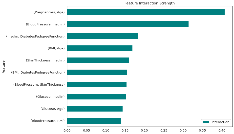
There is a strong interaction between number of pregnancies and age and also between blood pressure and Insulin. All of these interactions are 2-way.
Takeaways:-
- The statistic detects all kinds of interactions, regardless of their particular form.
- Since the statistic is dimensionless and always between 0 and 1, it is comparable across features and even across models (though not yet for Python users)
- The H-statistic tells us the strength of interactions, but it does not tell us how the interactions look like. The next category of interpretation methods are precisely for that.
Partial Dependence Plots (PDP)
The partial dependence plot (short PDP or PD plot) shows the marginal effect one or two features can have on the predicted outcome of a machine learning model. It can show the nature of relationship between the target and a feature, which could be linear, monotonous or more complex.
The partial dependence plot is a both a global and local method. The method considers all instances and gives a statement about the global relationship of a feature with the predicted outcome (through the yellow line) and the relationship of all the unique instances (rows in the dataframe) with the outcome with the blue lines.
from pdpbox import pdp, info_plots
pdp_ = pdp.pdp_isolate(
    model=estimator, dataset=X_train, model_features=X_train.columns, feature='Glucose'
)
fig, axes = pdp.pdp_plot(
    pdp_isolate_out=pdp_, feature_name='Glucose', center=True,
     plot_lines=True, frac_to_plot=100)
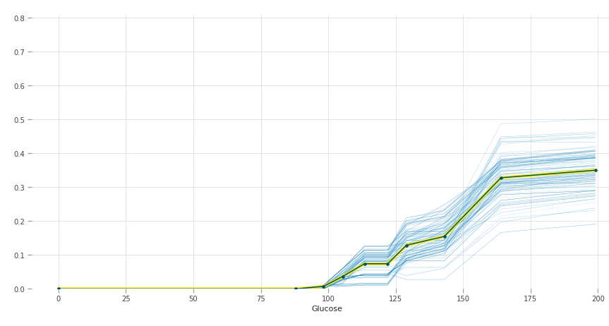
The y-axis can be interpreted as change in the prediction from what it would be predicted at the baseline or leftmost value. The blue lines are all the instances and the yellow line provides average marginal effect over them. The heterogeneous effects can be seen by the blue lines.
Higher blood sugar increases the chances of having diabetes. Normal fasting blood glucose is between 70 and 100 mg/dL for non-diabetic people, which is also justified by the graph.
pdp_ = pdp.pdp_isolate(
    model=estimator, dataset=X_train, model_features=X_train.columns, feature='Age'
)
fig, axes = pdp.pdp_plot(
    pdp_isolate_out=pdp_, feature_name='Age', center=True, x_quantile=True,
     plot_lines=True, frac_to_plot=100)
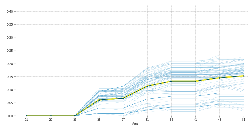
According to our model, after 23 years of age people are more susceptible to diabetes.
PDPs are easy to implement and intuitive. Since PDP plots show the marginal effect, which by definition assumes other covariates are constant, it ignores the fact that features in the real world are usually correlated. So, for a house price regression problem, two features would be the area of the house and the number of rooms. For calculating the marginal effect that number of rooms have on price, it would keep area of the house constant at let's say 30m2, which would be very unlikely for a house with 10 rooms.
Accumulated Local Effects (ALE) plots solve the above mentioned problem by looking at the conditional distribution of all features(rather than marginal) and takes into account differences in predictions(instead of averages).
Local Interpretable Model-agnostic interpretation (LIME)
LIME uses a surrogate model to make interpretations. Surrogate models are trained to approximate the predictions of the underlying black box model using sparse linear models(called the surrogate). These surrogate models only approximate the local behavior of the model and not the global.
Let's take a look at the steps performed by LIME by taking an example.
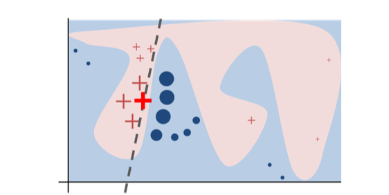
The original model's decision function is represented by the blue/pink background, which is clearly nonlinear. The bright red cross is the instance being explained (we'll call it X). We sample perturbed instances around X, and weight them according to their proximity to X (weight in the figure is represented by size). The original model's prediction on these perturbed instances is used to learn a linear model (dashed line) that approximates the model well in the vicinity of X. Therefore, the explanation works well locally and not globally.
import lime
import lime.lime_tabular
classes=['non-diabetic','diabetic']
explainer = lime.lime_tabular.LimeTabularExplainer(X_train.astype(int).values,
mode='classification',training_labels=y_train,feature_names=features,class_names=classes)
#Let's take a look for the patient in 100th row
i = 100
exp = explainer.explain_instance(X_train.loc[i,features].astype(int).values, estimator.predict_proba, num_features=5)
# visualize the explanation
exp.show_in_notebook(show_table=True)
``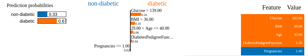
Orange colored features supports diabetic class, and blue supports non-diabetic class.
There are three parts to the explanation :-
- The top left part gives the prediction probabilities for class 0 and class 1.
- The middle part gives the 5 most important features. Features in orange contribute to the diabetic class and features in blue contribute to the non-diabetic class.
- The right part follows the same color coding as 1 and 2. It contains the actual values for the top 5 variables.
This can be read as: the woman is diabetic with a probability of 0.67. Her Glucose level, BMI , Age and DiabetesPedigreeFunction all add up to the prediction being diabetic, and we have seen in the PDP plot how it does so. However, she has only one pregnancy, which does not contribute to diabetes, but this has a lesser weight as compared to other more crucial features in determining diabetes.
If this visualization sparked your interest in lime, here's the documentation.
Takeaways:-
- Human-friendly explanations that are very useful when explaining to a lay person.
- LIME suffers from the same limitation of ignoring correlation like other methods we have talked about. Data points are sampled from a Gaussian distribution, with the assumption that the features are not correlated. This can lead to unlikely data points which can then be used to learn local explanation models.
- The explanations can also be unstable. If you repeat the sampling process, then the explanations that come out can be different.
SHAP
SHAP (SHapley Additive exPlanations) is a popular interpretation method that can be used for both global and local explanations. It leverages game theory to measure the impact of the features on the predictions . To explain a prediction we can start with the assumption that each feature value of the instance is a “player” in a game where the prediction is the payout. Then the shapley value will tell you how to fairly distribute the “payout” among the features.
More precisely, the “game” is the prediction task for a single instance of the dataset. The “gain” is the actual prediction for this instance minus the average prediction for all the instances fed into your model. The “players” are the feature values of the instance that collaborate to receive the gain or predict a certain value.
Let's take an example from this book, to understand this better.
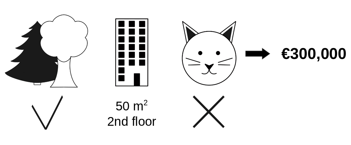
Going back to our earlier example of predicting apartment prices. Let's say for a certain apartment the price is predicted as 300,000 USD and our job is to explain this prediction. Some features that went into this prediction inlude:
- the apartment has a size of 50 m2
- It is located on the 2nd floor
- It has a park nearby
- Cats are banned.
Now, the average prediction for all apartments is 310,000 USD. We want to know, how much has each feature value contributed to the prediction compared to the average prediction?
The answer could be: the park-nearby contributed 30,000 USD , size - 50 contributed 10,000 USD, floor - 2nd contributed 0 USD, cat - banned contributed -50,000 USD. The contributions add up to -10,000 USD, and the final prediction minus the average accurately predicted apartment price.
The Shapley value is calculated as the average marginal contribution of a feature value across all possible coalitions. Coalitions are nothing but different simulated environments created by varying a feature while keeping everything else constant and noticing the effect. For example if " cat-banned" is changed to "cat-allowed" and all the other features are same , we check how the prediction changed.
Let's try to interpret the classification made for a patient.
import shap
# create our SHAP explainer
shap_explainer = shap.TreeExplainer(estimator)
# calculate the shapley values for our data
shap_values = shap_explainer.shap_values(X_train.iloc[7])
# load JS to use the plotting function
shap.initjs()
shap.force_plot(shap_explainer.expected_value[1], shap_values[1], X_train.iloc[7])
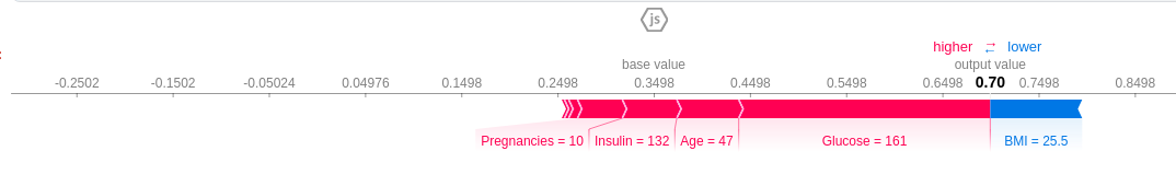
Features causing increase in prediction are in pink and features causing a decrease in prediction are in blue, along with their value representing the magnitude of effect. The base value is 0.3498 and we predict 0.7. This patient is classified as diabetic ,the features that pushed the result towards diabetic were Glucose level=161, Age=47, Insulin=132 and 10 pregnancies. The BMI feature, which is low, tries to negate the effect, but couldn't because the combined effect of the pink features far outweighs it.
If you subtract the length of the blue bars from the length of the pink bars, it equals the distance from the base value to the output.
Let's also take a look at the Summary plot to get a global picture of the model.
shap_values = shap_explainer.shap_values(X_train)
shap.summary_plot(shap_values[1], X_train,auto_size_plot=False)
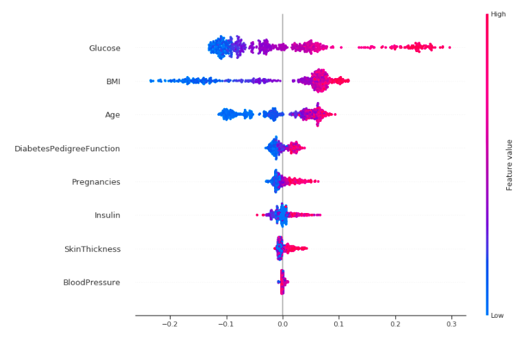
Okay, let's try to interpret this!
This plot is made of many dots. Each of them has three characteristics:
- Vertical location shows what feature it is depicting.
- Color shows whether that feature was high or low for that row of the dataset.
- Horizontal location shows whether that value had a negative or positive effect on the prediction.
The dots on the rightmost in the glucose row are pink which means Glucose level is high, which increases the chance of diabetes, like we have seen before. The same is true for other features like BMI, age and pregnancies but the effect is more clear for Glucose.
Takeaways:
- The interpretation is quite fast when compared to other methods and this technique has a solid foundation in game theory.
- The difference between the prediction and the average prediction is fairly distributed among the feature values of the instance unlike LIME.
- KernelSHAP(what we discussed earlier) ignores feature dependence because it is usually easier to sample from a marginal distribution. However, if features are correlated, this leads to putting too much weight on unlikely data points. TreeSHAP, another variant of SHAP, solves this problem by explicitly modeling the conditional expected prediction.
Conclusion
Machine Learning applications are increasingly being adopted in the industry and in the coming decades it will only become more ubiquitous. To ensure these systems do not catastrophically fail in the real world like in the Zillow debacle, we need to focus more on explainability and less on complex and fancy architectures.
This blog was aimed at giving you a glimpse inside the world of interpretability. If you feel encouraged to learn more about it, I would highly recommend this amazing book by Christoph Molnar: Interpretable ML Book.