Audio analysis and signal processing have benefited greatly from machine learning and deep learning techniques but are underrepresented in data scientist training and vocabulary where fields like NLP and computer vision predominate.
In this series of articles we'll try to rebalance the equation a little bit and explore machine learning and deep learning applications related to audio.
Bring this project to life
Introduction
Let's get some basics out of the way. Sound travels in waves that propagate through vibrations in the medium the wave is traveling in. No medium, no sound. Hence, sound doesn't travel in empty space.
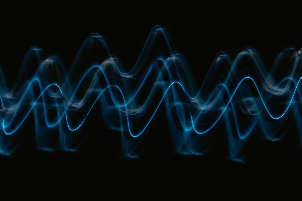
These vibrations are usually represented using a simple two-dimensional plot, where the $x$ dimension is time and the $y$ dimension is the magnitude of said pressure wave.
Sound waves can be imagined as pressure waves by understanding the idea of compressions and rarefactions. Take a tuning fork. It vibrates back and forth, pushing the particles around it closer or farther apart. The parts where air is pushed closer together are called compressions, and the parts where it is pushed further apart are called rarefactions. Such waves that traverse space using compressions and rarefactions are called longitudinal waves.
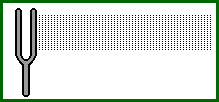
A wavelength is the distance between two consecutive compressions or two consecutive rarefactions. Frequency, or pitch, is the number of times per second that a sound wave repeats itself. Then the velocity of a wave is the product of the wavelength and the frequency of the wave.
$$ v = \lambda * f $$
Where $ v $ is the velocity of the wave, $ \lambda $ is the wavelength, and $ f $ is the frequency.
The thing is, in the natural environment, it very rarely happens that the sound we hear or observe comes in one clear frequency (in a discernible sinusoidal magnitude pattern). Waves superimpose upon each other, making it very difficult to understand only via magnitude readings which frequencies are playing a part. Understanding frequencies can be very important. Its applications range from creating beautiful music to making sure engines don't explode under acoustic pressure waves resonating with each other.
Fourier Transforms
Once upon a time, Joseph Fourier made up his mind about every curve on the planet. He came up with the crazy idea that every curve can be represented as a sum of sinusoidal waves of various magnitudes, frequencies, and phase differences. A straight line, a circle, some weird freehand drawing of Fourier himself. Check out the video linked below to understand how intricate this simple idea really is. The video describes the Fourier Series, which is a superposition of several sine waves that are built in a way to satisfy the initial distribution.
All of it, a simple collection of different sine waves. Crazy, right?
Fourier transforms are a way of getting all the coefficients of different frequencies and their interactions with each other, given such initial conditions. In our case, our magnitude data from our sound pressure wave would be our initial condition, that Fourier transforms will help us instead convert to an expression that describes at any time the contribution of different frequencies in creating the sound you finally hear. We call this transformation moving from a time-domain representation to a frequency domain representation.
For a discrete sequence $ \{x_{n}\}:= x_{0}, x_{1}, ... x_{n-1} $, since computers don't understand continuous signals, a transformed representation in the frequency domain $ \{X_{n}\}:= X_{0}, X_{1}, ... X_{n-1} $ can be found using the following formulation:
$$ X_{k} = \sum_{n = 0}^{N - 1} x_{n} e^{\frac{-2 \pi i}{N}k n} $$
Which is equivalent to:
$$ X_{k} = \sum_{n = 0}^{N - 1} x_{n} [ cos(\frac{2 \pi}{N} k n) - i.sin(\frac{2 \pi}{N} k n) ] $$
A Fourier transform is a reversible function, and an inverse fourier transform can be found as follows:
$$ x_{n} = \frac{1}{N} \sum_{n = 0}^{N - 1} X_{k} e^{\frac{2 \pi i}{N}k n} $$
Now, A discrete Fourier transform is computationally quite heavy to calculate, with a time complexity of the order $ O(n^{2}) $. But there is a faster algorithm called Fast Fourier Transform (or FFT) that performs with a complexity of $ O(n.log(n)) $. This is a significant boost in speed. Even for an input with $ n = 50 $, there is a significant increase in performance.
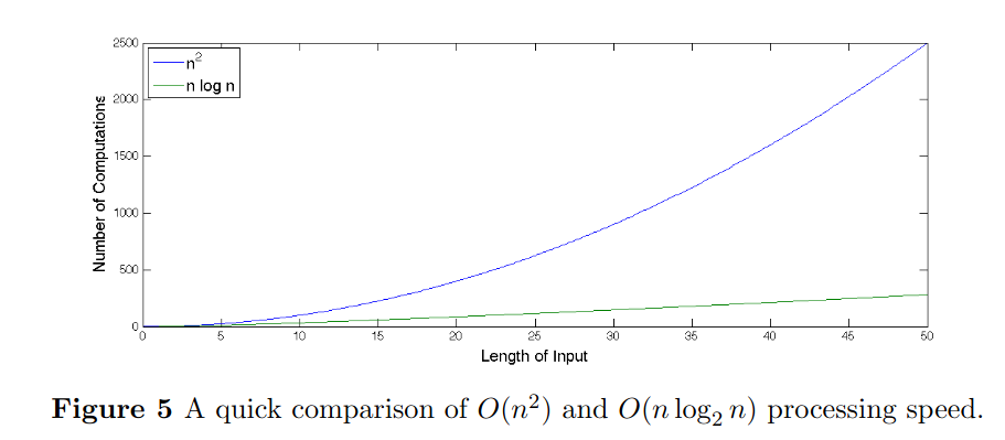
If we use audio that has a sampling frequency of 11025 Hz, in a three minute song, there are about 2,000,000 input points. In that case, the $ O(n.log(n)) $ FFT algorithm provides a frequency representation of our data:
$$ \frac{n^{2}}{n.log_{2}(n)} = \frac{(2·10^{6})^{2}}{(2·10^{6}). log_{2}(2·10^{6})} $$
100,000 times faster!
Though there are a lot of variations of the algorithm today, the most commonly used is the Cooley-Tucker FFT algorithm. The simplest form of it, Radix-2 Decimation in Time (DIT) FFT, first computes the DFTs of the even-indexed inputs and of the odd-indexed inputs and then combines those two results to produce the DFT of the whole sequence. This idea can then be performed recursively to reduce the overall runtime to O(N log N). They exploit the symmetry in the DFT algorithm to make it faster. There are more general implementations, but the more common ones work better when the input size is a power of 2.
Short-Time Fourier Transforms
With Fourier transforms, we convert a signal from the time domain into the frequency domain. In doing so, we see how every point in time is interacting with every other for every frequency. Short-time Fourier transforms do so for the neighboring points in time instead of the entire signal. This is done by utilizing a window function that hops with a specific hop length to give us the frequency domain values.
Let $ x $ be a signal of length $ L $ and $ w $ be a window function of length $ N $. Then the maximal frame index $ M $ would be $ \frac{L - N}{N}$. $ X(m, k) $ would denote the $ k^{th} $ fourier coefficient at $m^{th}$ time frame. Another parameter defined is $ H $, called the hop size. It determines the step size of the window function.
Then STFT $ X(m, k) $ is given by:
$$ X(m, k) = \sum_{n = 0}^{N - 1} x[n + m.H] . w[n] . e^{\frac{-2 \pi i}{N}k n} $$ There are a variety of window functions one can chose from; Hann, Hamming, Blackman, Blackman-Harris, Gaussian, etc.
The STFT can provide a rich visual representation for us to analyze, called a spectrogram. A spectrogram is a two-dimensional representation of the square of the STFT $ X(m, k) $, and can give us important visual insight into which parts of a piece of audio sound like a buzz, a hum, a hiss, a click, or a pop, or if there are any gaps.
The Mel Scale
Thus far, we have gotten a grip on different methods used to analyze sound, assuming it is on a linear scale. Our perception of sound is not linear, though. It turns out we can differentiate between lower frequencies a lot better than the higher ones. To capture this, the Mel scale was proposed as a transformation to represent what our perception of sound thinks of as a linear development in frequencies.
A popular formula to convert frequency in Hertz to Mels is:
$$ m = 2595 . log_{10}(1 + \frac{f}{700}) $$
There have been other less popular attempts at defining a scale for psychoacoustic perceptions like the Bark scale. There is a lot more to psychoacoustics than what we are covering here, like how the human ear works, how we perceive loudness, timbre, tempo and beat, auditory masking, binaural beats, HRTFs, etc. If you're interested, this, this, and this might be good introductory resources.
There is of course some criticism associated with the Mel scale regarding how controlled the experiments to create the scale really were, and if the results are biased. Was it tested on musicians and non-musicians equally? Is the subjective opinion of every person about what they perceive as linear really a good way to decide what human perception, in general, behaves like?
Unfortunately, we won't be getting into said discussions about biases any further. We will instead take the Mel Scale and apply it in a way that we can get a spectrogram-like representation that was facilitated earlier by STFTs.
Filter Banks and MFCCs
MFCCs or Mel Frequency cepstral coefficients have become a popular way of representing sound. In a nutshell, MFCCs are calculated by applying a pre-emphasis filter on an audio signal, taking the STFT of that signal, applying mel scale-based filter banks, taking a DCT (discrete cosine transform), and normalizing the output. Lots of big words there, so let's unpack it.
The pre-emphasis filter is a way of stationarizing the audio signal using a weighted single order time difference of the signal.
$$ y(t) = x(t) - \alpha x(t - 1) $$
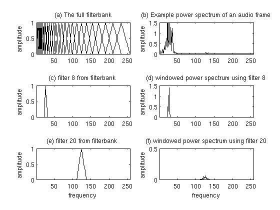
The filter banks are a bunch of triangular waveforms. These triangular filters are applied to the STFT to extract the power spectrum. Each filter in the filter bank is triangular with a magnitude of 1 at the center, and frequency linearly decreasing to 0 at the center of the next filter bank's central frequency.
This is a set of 20-40 triangular filters between 20Hz to 4kHz that we apply to the periodogram power spectral estimate we got from the STFT of the pre-emphasis filtered signal. Our filterbank comes in the form of as many vectors as the number of filters, each vector the size of the number of frequencies in the Fourier transform. Each vector is mostly zeros, but is non-zero for a certain section of the spectrum. To calculate filterbank energies we multiply each filterbank with the power spectrum, then add up the coefficients.
You can learn more about them here and here.
Finally, the processed filter banks are passed through a discrete cosine transform. The discrete cosine of a signal can be represented as follows:
$$ X_{k} = \sum_{n = 0}^{N - 1} x_{n} cos[\frac{\pi}{N}(n + \frac{1}{N}) k ] $$
Where $ k = 0, .... , N - 1 $.
Introduction to Librosa
Let's get our hands dirty. Librosa is a Python library that we will use to look through the theory we went through in the past few sections.
sudo apt-get update
sudo apt-get install ffmpeg
pip install librosa
Let's open an mp3 file. Because it only seems appropriate, I'll try the song Fa Fa Fa by Datarock... from the album Datarock Datarock.
import librosa
from matplotlib import pyplot as plt

x, sampling_rate = librosa.load('./Datarock-FaFaFa.mp3')
print('Sampling Rate: ', sampling_rate)
plt.figure(figsize=(14, 5))
plt.plot(x[:sampling_rate * 5])
plt.title('Plot for the first 5 seconds')
plt.xlabel('Frame number')
plt.ylabel('Magnitude')
plt.show()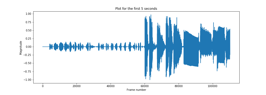
So that's our time domain signal. The default sampling rate used by librosa is 22050, but you can pass anything you like.
x, sampling_rate = librosa.load('./Datarock-FaFaFa.mp3', sr=44100)
print('Sampling Rate: ', sampling_rate)
plt.figure(figsize=(14, 5))
plt.plot(x[:sampling_rate * 5])
plt.title('Plot for the first 5 seconds')
plt.xlabel('Frame number')
plt.ylabel('Magnitude')
plt.show()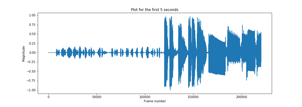
Passing a null value in the sampling ratio argument returns the file loaded with the native sampling ratio.
x, sampling_rate = librosa.load('./Datarock-FaFaFa.mp3', sr=None)
print('Sampling Rate: ', sampling_rate)
This gives me:
Sampling Rate: 44100librosa provides a plotting functionality in the module librosa.display too.
import librosa.display

plt.figure(figsize=(14, 5))
librosa.display.waveplot(x[:5*sampling_rate], sr=sampling_rate)
plt.show()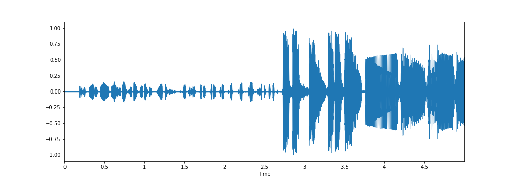
I don't know why the librosa.display is able to capture certain lighter magnitude fluctuations past the 3.5 seconds mark that weren't captured by the matplotlib plots.
librosa also has a bunch of example audio files that can be used for experimentation. You can view the list using the following command.
librosa.util.list_examples()The output:
AVAILABLE EXAMPLES
--------------------------------------------------------------------
brahms    	Brahms - Hungarian Dance #5
choice    	Admiral Bob - Choice (drum+bass)
fishin    	Karissa Hobbs - Let's Go Fishin'
nutcracker	Tchaikovsky - Dance of the Sugar Plum Fairy
trumpet   	Mihai Sorohan - Trumpet loop
vibeace   	Kevin MacLeod - Vibe Ace
And you can use the iPython display to play audio files on Jupyter notebooks like this:
import IPython.display as ipd

example_name = 'nutcracker'
audio_path = librosa.ex(example_name)
ipd.Audio(audio_path, rate=sampling_rate)
You can extract the sampling rate and duration of an audio sample as follows.
x, sampling_rate = librosa.load(audio_path, sr=None)
sampling_rate = librosa.get_samplerate(audio_path)
print('sampling rate: ', sampling_rate)
duration = librosa.get_duration(x)
print('duration: ', duration)
The output is:
sampling rate:  22050
duration:  119.87591836734694
Plotting an STFT-based spectrogram can be done as follows:
from matplotlib import pyplot as plt

S = librosa.stft(x)
fig = plt.figure(figsize=(12,9))
plt.title('STFT Spectrogram (Linear scale)')
plt.xlabel('Frame number')
plt.ylabel('Frequency (Hz)')
plt.pcolormesh(np.abs(S))
plt.savefig('stft-plt.png')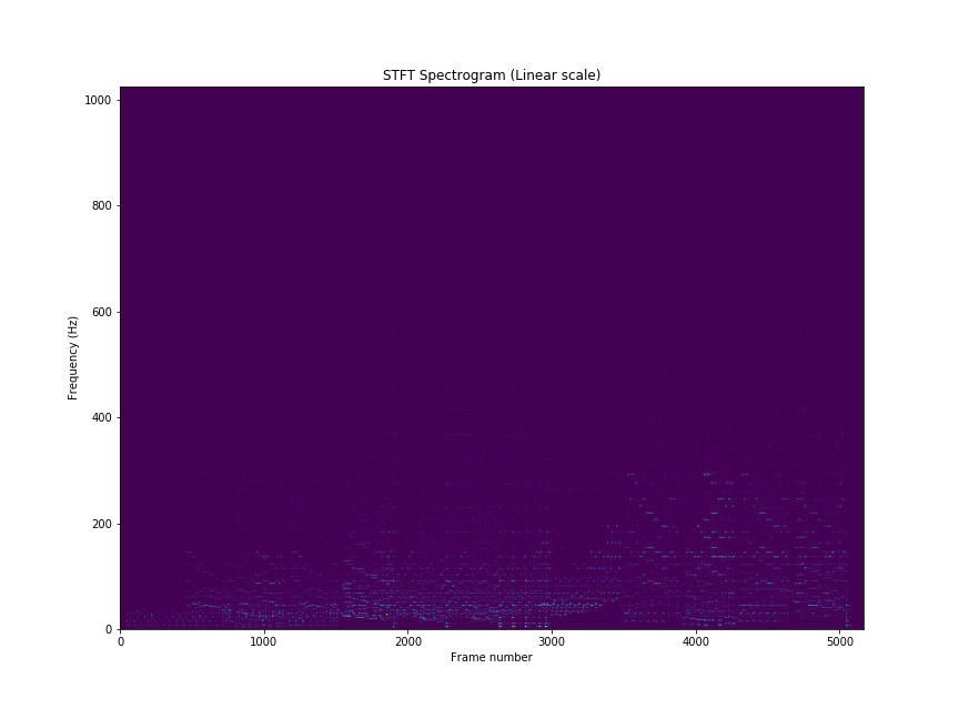
You can also use librosa functionality for plotting spectrograms.
fig, ax = plt.subplots(figsize=(15,9))
img = librosa.display.specshow(S, x_axis='time',
                         y_axis='linear', sr=sampling_rate,
                         fmax=8000, ax=ax)
fig.colorbar(img, ax=ax, format='%+2.0f dB')
ax.set(title='STFT linear scale spectrogram')
plt.savefig('stft-librosa-linear.png')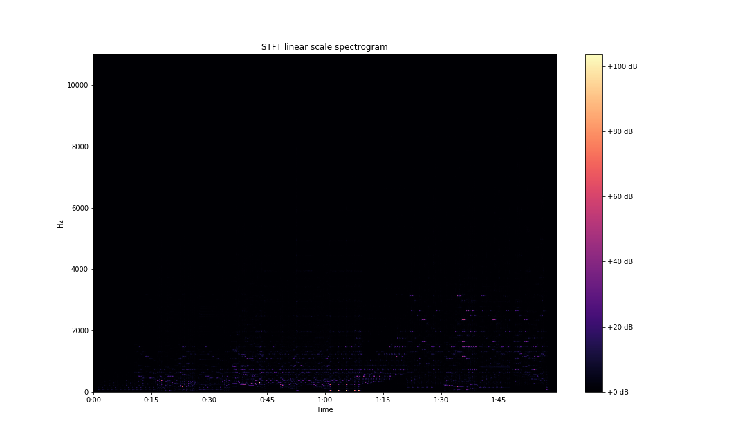
Spectral Features
To start understanding how frequencies are changing in the sound signal, we can start by looking at the spectral centroids of our audio clip. These indicate where the center of mass of the spectrum is located. Perceptually, it has a robust connection with the impression of the brightness of a sound.
plt.plot(librosa.feature.spectral_centroid(x, sr=sampling_rate)[0])
plt.xlabel('Frame number')
plt.ylabel('frequency (Hz)')
plt.title('Spectral centroids')
plt.show()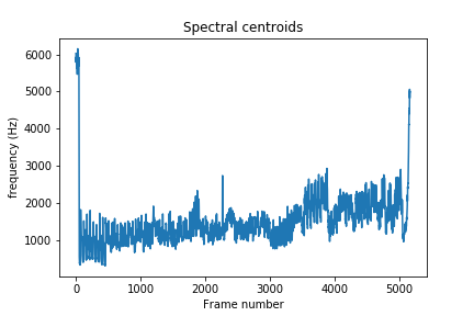
You can also compare the centroid with the spectral bandwidth of the sound over time. Spectral bandwidth is calculated as follows:
$$ (\sum_k S[k, t] * (freq[k, t] - centroid[t])^{p})^{\frac{1}{p}} $$
Where $ k $ is the frequency bin index, $ t $ is the time index, $ S [k, t] $ is the STFT magnitude at frequency bin $ k $ and time $ t $, $ freq[k, t] $ is the frequency at frequency bin $ k $ and time $ t $, $ centroid $ is the spectral centroid at time $ t $, and finally $ p $ is the power to raise deviation from spectral centroid. The default value of $ p $ for librosa is $ 2 $.
spec_bw = librosa.feature.spectral_bandwidth(x, sr=sampling_rate)
plt.xlabel('Frame number')
plt.ylabel('frequency (Hz)')
plt.title('Spectral bandwidth')
plt.show()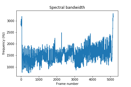
You can also visualize the deviation from centroid by running the following code:
times = librosa.times_like(spec_bw)
centroid = librosa.feature.spectral_centroid(S=np.abs(S))

fig, ax = plt.subplots(figsize=(15,9))
img = librosa.display.specshow(S_dB, x_axis='time',
                         y_axis='log', sr=sampling_rate,
                         fmax=8000, ax=ax)
fig.colorbar(img, ax=ax, format='%+2.0f dB')
ax.set(title='Spectral centroid plus/minus spectral bandwidth')
ax.fill_between(times, centroid[0] - spec_bw[0], centroid[0] + spec_bw[0],
                alpha=0.5, label='Centroid +- bandwidth')
ax.plot(times, centroid[0], label='Spectral centroid', color='w')
ax.legend(loc='lower right')
plt.savefig('centroid-vs-bw-librosa.png')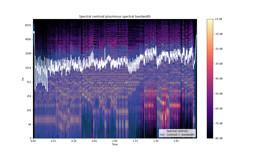
We can also look at spectral contrast. Spectral contrast is defined as the level difference between peaks and valleys in the spectrum. Each frame of a spectrogram $S$ is divided into sub-bands. For each sub-band, the energy contrast is estimated by comparing the mean energy in the top quartile (peak energy) to that of the bottom quartile (valley energy). Energy is dependent on the power spectrogram and the window function and size.
contrast = librosa.feature.spectral_contrast(S=np.abs(S), sr=sampling_rate)Plotting the contrast to visualize the frequency bands:
fig, ax = plt.subplots(figsize=(15,9))
img2 = librosa.display.specshow(contrast, x_axis='time', ax=ax)
fig.colorbar(img, ax=ax, format='%+2.0f dB')
ax.set(ylabel='Frequency bands', title='Spectral contrast')
plt.savefig('spectral-contrast-librosa.png')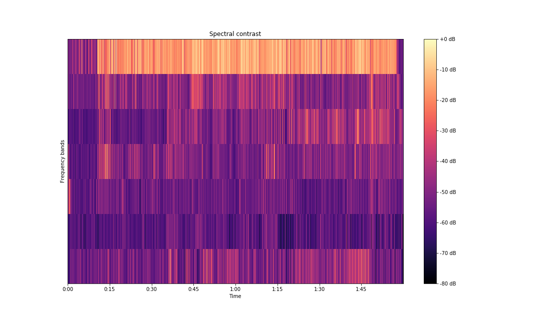
There are many more spectral features. You can read more about them here.
Understanding Spectrograms
A linear scale spectrogram doesn't capture information very clearly. There are better ways of representing this information. librosa allows us to plot the spectrogram on a log scale. To do so, change the above code to this:
S = librosa.stft(x)
fig, ax = plt.subplots(figsize=(15,9))
img = librosa.display.specshow(S, x_axis='time',
                         y_axis='log', sr=sampling_rate,
                         fmax=8000, ax=ax)
fig.colorbar(img, ax=ax, format='%+2.0f dB')
ax.set(title='STFT log scale spectrogram')
plt.savefig('stft-librosa-log.png')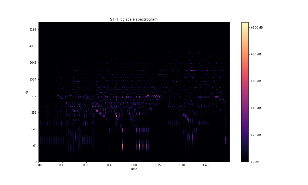
Utilizing the STFT matrix directly to plot doesn't give us clear information. A common practice is to convert the amplitude spectrogram into a power spectrogram by squaring the matrix. Following this, converting the power in our spectrogram to decibels against some reference power increases the visibility of our data.
The formula for decibel calculation is as follows:
$$ A = 10 * log_{10}(\frac{P_{2}}{P_{1}}) $$
Where $ P_{1} $ is the reference power and $ P_{2} $ is the measured value.
librosa has two functions in the API that allow us to make these calculations. librosa.core.power_to_db makes the calculation mentioned above. The function librosa.core.amplitude_to_db also handles the spectrogram conversion from amplitude to power by squaring said spectrogram before converting it to decibels. Plotting STFTs after this conversion gives us the following plots.
S_dB = librosa.amplitude_to_db(S, ref=np.max)
fig, ax = plt.subplots(figsize=(15,9))
img = librosa.display.specshow(S_dB, x_axis='time',
                         y_axis='linear', sr=sampling_rate,
                         fmax=8000, ax=ax)
fig.colorbar(img, ax=ax, format='%+2.0f dB')
ax.set(title='STFT (amplitude to DB scaled) linear scale spectrogram')
plt.savefig('stft-librosa-linear-db.png')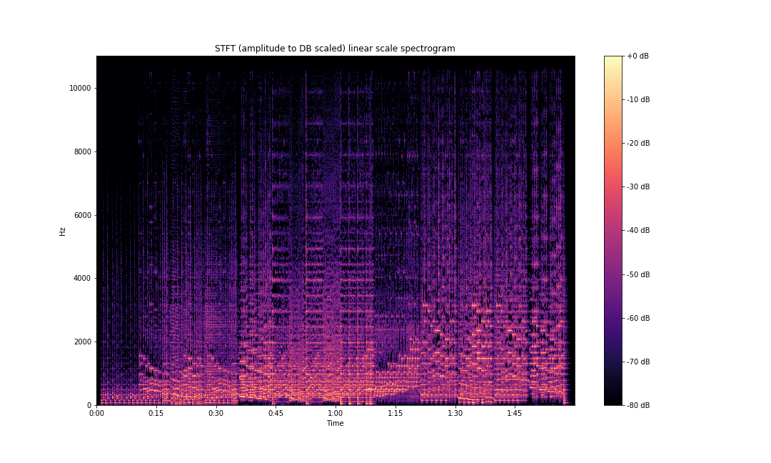
And in log scale:
S_dB = librosa.amplitude_to_db(S, ref=np.max)
fig, ax = plt.subplots(figsize=(15,9))
img = librosa.display.specshow(S_dB, x_axis='time',
                         y_axis='log', sr=sampling_rate,
                         fmax=8000, ax=ax)
fig.colorbar(img, ax=ax, format='%+2.0f dB')
ax.set(title='STFT (amplitude to DB scaled) log scale spectrogram')
plt.savefig('stft-librosa-log-db.png')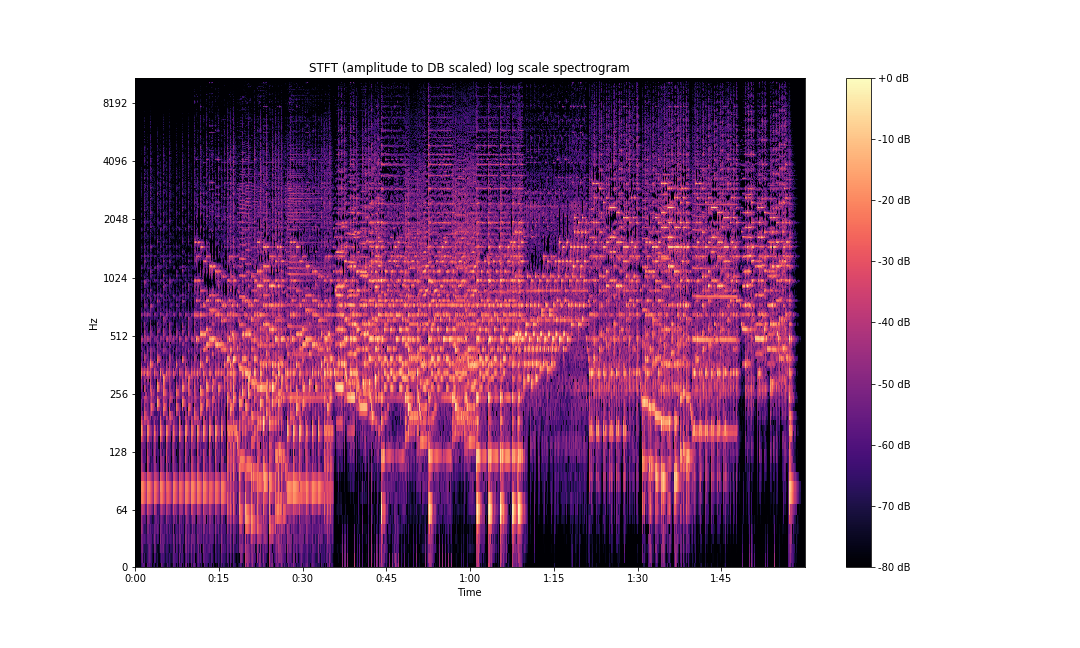
As can be seen above, the frequency information is so much clearer compared to our initial plots.
As we discussed earlier, human sound perception is not linear, and we are able to differentiate between lower frequencies a lot better than higher frequencies. This is captured by the mel scale. librosa.display.specshow also provides a mel scale plotting functionality.
fig, ax = plt.subplots(figsize=(15,9))
img = librosa.display.specshow(S_dB, x_axis='time',
                         y_axis='mel', sr=sampling_rate,
                         fmax=8000, ax=ax)
fig.colorbar(img, ax=ax, format='%+2.0f dB')
ax.set(title='Mel scaled STFT spectrogram')
plt.savefig('stft-librosa-mel.png')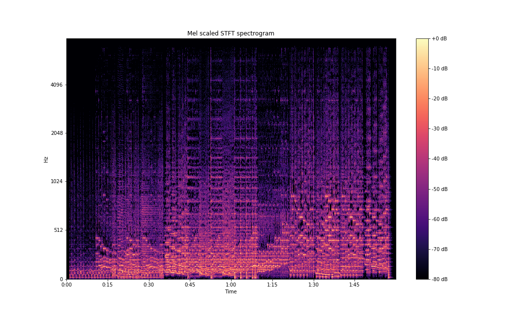
This is not the same as a mel spectrogram. A mel spectrogram, as we learned earlier, is calculated by taking the power spectrogram and multiplying it with mel filters.
You can also use librosa to generate mel filters.
n_fft = 2048 # number of FFT components
mel_basis = librosa.filters.mel(sampling_rate, n_fft)
Calculate the mel spectrogram using the filters as follows:
mel_spectrogram = librosa.core.power_to_db(mel_basis.dot(S**2))
librosa has a wrapper for mel spectrograms in its API that can be used directly. It takes the time domain waveform as an input and gives us the mel spectrogram. It can be implemented as follows:
mel_spectrogram = librosa.power_to_db(librosa.feature.melspectrogram(x, sr=sampling_rate))For plotting the mel spectrogram:
fig, ax = plt.subplots(figsize=(15,9))
img = librosa.display.specshow(mel_spectrogram, x_axis='time',
                         y_axis='mel', sr=sampling_rate,
                         fmax=8000, ax=ax)
fig.colorbar(img, ax=ax, format='%+2.0f dB')
ax.set(title='Mel-frequency (power to DB scaled) spectrogram')
plt.savefig('mel-spec-librosa-db.png')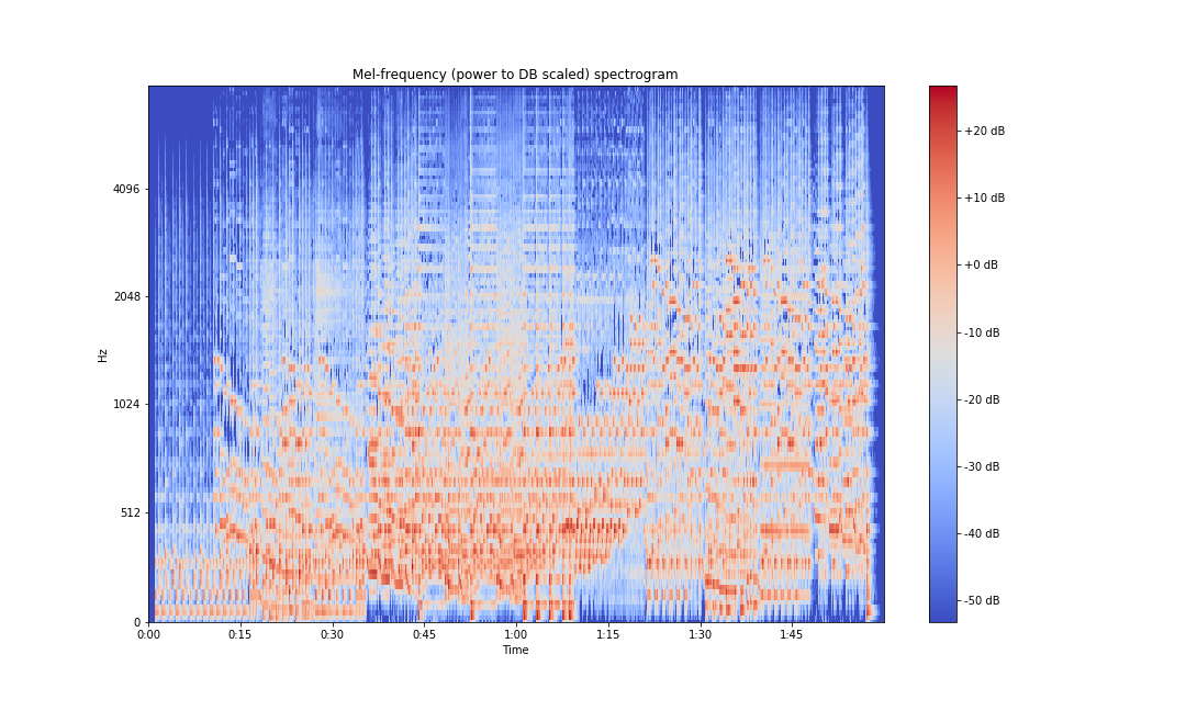
To calculate MFCCs, we take a discrete cosine transform.
import scipy
mfcc = scipy.fftpack.dct(mel_spectrogram, axis=0)
librosa again has a wrapper implemented for MFCCs, which can be used to get the MFCC array and plots.
mfcc = librosa.core.power_to_db(librosa.feature.mfcc(x, sr=sampling_rate))
fig, ax = plt.subplots(figsize=(15,9))
img = librosa.display.specshow(mfcc, x_axis='time',
                         y_axis='mel', sr=sampling_rate,
                         fmax=8000, ax=ax)
fig.colorbar(img, ax=ax, format='%+2.0f dB')
ax.set(title='MFCCs')
plt.savefig('mfcc-librosa-db.png')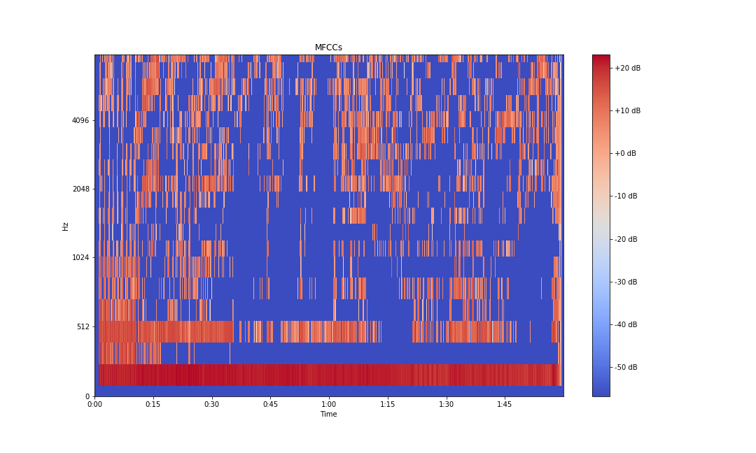
Typically, the first 13 coefficients extracted from the mel cepstrum are called the MFCCs. These hold very useful information about audio and are often used to train machine learning models.
Conclusion
In this article, we learned about audio signals, time and frequency domains, Fourier transforms, and STFTs. We learned about the mel scale and cepstrums, or mel spectrograms. We also learned about several spectral features like spectral centroids, bandwidths, and contrast.
In the next part of this two-part series, we will look into pitches, octaves, chords, chroma representations, beat and tempo features, onset detection, temporal segmentation, and spectrogram decomposition.
I hope you found the article useful.